The Photoshop Guru's Handbook - "Creating the NUI" Part 2 - Nutz & Bolts (mini Interface project) Layer 14 a ) Create a New layer. b ) Use the Line tool and make yourself a small cross that will fit between the two arrows (see the sample picture). Use a line width of about 3 pixels, without anti-aliasing. You can hold the Shift key down when you create a line, to be sure they come out straight. c ) Once you've made your cross, and centered it between the arrows with the Move tool, go up to the Filter menu and choose Stylize/Emboss. Set the Angle to 120, Height to 2, and Amount to 150. Click OK to apply the filter. d ) Set the layer's Blend mode to Softlight, and we're DONE! 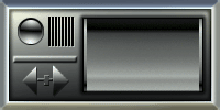 Ok, this, or something very close to this, is what you should now have after completing all the steps. Ok, this, or something very close to this, is what you should now have after completing all the steps.Wheeew! Did that seem long to you? Well, maybe just a tad. But as you become more familiar with these kinds of techniques you'll be blazing through them fairly quickly when you go to create something. Practise makes perfect. Remember, if yours didn't turn out all that well, don't worry about it. This was just an exercise, not a paying gig. And you can always print out these pages and go over the steps again at any time. That's why i've gone to such great lengths to organize this excercise according to the layers. All you have to do is refer back to a certain layer that produced a specific effect, and go over that technique until you're real familiar with it. :?)> So now... let's see, where are we... Oh yes, remember the project i suggested you do for part 1 - "Concept of Design"? The one where you designed your own Interface and drafted it out on paper? Well NOW, what you need to do is take that design, study it's shapes, go to the beginning of "Nutz & Bolts" and see if i've covered all or some of the shapes that your design uses. Then create those basic shapes in Photoshop, and stack them separately on their own layers. Move them around, mix them up, and piece them together over top of one another until you get the overall shape that your Interface design has. Once you've created the overall shapes for your Interface, you can then use the techniques we just went through to give your Interface some body. Just like we did for this exercise Interface. We started with a flat black rectangle, and look how it ended up! These techniques are really very simple. In fact, it's probably harder to understand 'how' they work than it is to just learn and use them. But understanding 'what' makes them work will come with experience. No mystery there. :?)> Ok let's head back now. We're going to talk about a few ways we can jazz up an Interface once the basic mold has been created, like the one we just did. It's only 2/3rds the way finished really. I like the metallic/plastic look it has, but let's see what else we can do with it. 1 / 2 / 3 / 4 / 5 / 6 To the Top - Page 6 - |
| "The Photoshop Guru's Handbook" ™ and all contents of this site are copyright 96/00 Mark Anthony Larmand - (aka theKeeper) all rights reserved. |