 |
Nutz & Bolts
"Dressing for the show..."
 In this last page, we'll go over a few ways to 'dress up' the Interface using texture pattern fills and flat colour fills. This is by far the easiest part of creating an Interface. In this last page, we'll go over a few ways to 'dress up' the Interface using texture pattern fills and flat colour fills. This is by far the easiest part of creating an Interface.
To give the Interface that 'funky sixties' pattern around the border, all i did was create another new layer above the main body of the Interface (which was on Layer 2 in the exercise), and filled it with the psychedelic texture pattern. Then, i 'clipped' the texture layer to 'Layer 2' by holding the Alt key down (Option for Mac) and clicking my mouse on the line that separates them in the layer palette.
Clipping layers together: When you hold the Alt key down and click and hold your mouse over the line you'll notice that the mouse pointer turns into a push tac. Once you click the mouse, a dotted line will appear indicating that the two layers are now clipped together, and the bottom one will act as a Mask for any layers above it that have been clipped to it. Adobe also made it easy to tell this at a quick glance by shifting the top-most layer(s) over to the right just a bit.
The inner body area of the Interface has a different texture pattern in it, so i created another layer for that texture. Because i wanted the texture to be effected by the gradient that we used over the main body area (Layer 3 of the exercise), i put this new texture layer just below that one. This time, i didn't clip the texture layer to another layer, i simply used the Rectangle selection tool and selected the inner area. I then opened my texture into Photoshop and selected ALL (Select/All), and defined it as a pattern (Edit/Define Pattern). I then closed my texture image and filled my selection with the texture pattern (Edit/Fill/Contents menu/Pattern). Simple as 1, 2, 3.
Colourizing different Interface parts:
If you want to add colour to any other parts of the Interface, such as the buttons or the embossed sections, you could use either of the two methods explained above. When you do decide to colourize certain sections though, be sure you put the colour layers above the part that's being coloured. And you'll have to change the colour layer's Blend mode to one that will allow the Interface part to show through the colour (Overlay, Hardlight, Softlight, Multiply, etc). I will very rarely use the Hue & Saturation filter to colour my Interface parts. I usually create a new layer for this, and fill a selection with my colour, or use the Clipping method. You have much more versitility to make edits to your Interface parts by colourizing this way.
Here's a fading effect you can use on your texture patterns:
You can try this right now if you wish.
If you have Photoshop open right now, create a New Document. Make it about 100x100 pixels, with a white background.
Create a new layer, and select the Gradient tool. Open the Options for the Gradient tool and click on the small arrow at the top right of the palette. From the pop-up menu select 'Transparent to Foreground'. 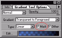 Also make sure to click in the Mask check box on the bottom of the Options palette. The Gradient Mask option will only work on gradients that contain transparency. By default there are 4 in the list, but you can also create your own using the Gradient Editor. Also make sure to click in the Mask check box on the bottom of the Options palette. The Gradient Mask option will only work on gradients that contain transparency. By default there are 4 in the list, but you can also create your own using the Gradient Editor.
Now open any texture into Photoshop and define it as a pattern (use the steps shown above). Create another new layer and fill it with your texture pattern (use the method above).
Now 'clip' these two layers together (use the method above). Notice how the texture seems to fade in from the top of the canvas? Now turn off the Background layer so you see just how the texture layer is being effected. Notice there's no texture OR colour at the top of the layer?
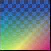 The checkered pattern you see here is the transparent background grid for my layers, not a texture pattern. Interesting effect isn't it? This same effect can also be accomplished by creating a Layer Mask on the texture layer, and applying a normal black-to-white gradient to the Mask. The black part of the gradient will create the transparent area in the texture. Experiment with both ways. The checkered pattern you see here is the transparent background grid for my layers, not a texture pattern. Interesting effect isn't it? This same effect can also be accomplished by creating a Layer Mask on the texture layer, and applying a normal black-to-white gradient to the Mask. The black part of the gradient will create the transparent area in the texture. Experiment with both ways.
And last but not least, we come to the part where we add a picture or photo to the screen part of our Interface. This is also a very simple task. In fact, you're probably leaving this page right now because you already know how to do it! :?)
First we create a new layer and put it right below the layer that is creating the 'sunken in' shadow effect around the screen area (that was Layer 7 in the exercise).
Open into Photoshop the picture or photo you want to use. If it's bigger than the Interface's screen area, you'll have to size it down, or crop it so you're only using a specific part of it. If you click on the Info Tab in the Options palette for the Rectangle selection tool it will show you the exact pixel size of selection you've made, and that's how big your picture will need to be. In case you were wondering, you can always just create an image from scratch for the screen area. Or use text in there instead.
Once you've got your picture or photo down to the right size, you can just copy and paste it into the layer you made for it. Then position it within the screen area.
Creating a 'glass cover' effect for the screen area:
Simple as can be. Create a new layer right above the one with your photo in it. Now Ctrl + click (Command + click for Mac) on the photo layer; this will create a selection the same size as the photo. Now apply a white to black gradient in the selected area, and set the layer's Blend mode to Hardlight, Screen, or Lighten; whichever looks best over your picture. You can also smooth out the gradient by adding Noise to it (Filter/Noise). Use a setting of 3 and click on the Uniform option.
That's it, we're done!
I hope everyone enjoyed this section of "theNUI". I look forward to you all returning for Part 3 - "2D & 3D (dimensional deliberations)". I will try my best to get it done as soon as possible, and as my schedule allows. It will probably be much shorter than these first two sections, so there's a good chance it will be done soon. Feel free to mail me if you have any questions.
Til then,
Onward'n'Upward!
Mark (aka theKeeper)
((( BACK --- HOME --- NEXT )))

Creating the NUI: Concept of Design / Nutz & Bolts / 2D & 3D / navDesign Summary |
|
|