- Page 4 -
The Photoshop Guru's Handbook - "Creating the NUI"
Part 3 - 2D & 3D (inDepth Interface project)
Creating Buttons & Lights
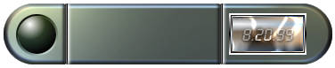
Interface buttons can come in a great many shapes, forms and sizes, and have a wide variety of functions to do with the interface. The simplest and most common type of button is the circular type. They're also the easiest shape to use when trying to explain how to create them, so that's what we'll create for this interface.
But keep in mind now that just because we'll be creating a circular button with these steps, doesn't mean you can't apply them to whatever shape button you want to, later.
Let's do it...
- Create a New layer. Name it 'Button-base'.
- Use the Elliptical marquee tool and create a circlular selection on the left side of the interface. Start the selection tool where you want the center of your button to be (use the sample image at the top as a reference). Hold down the Shift key and drag the tool away from the center. Stop when your button is as big as you'd like it.
- Fill the selection with the same grey we used for the main part of our interface body - a dark grey (web colour > 51,51,51). Leave the Blend mode of this layer on Normal. Leave the selection on, don't deselect yet.
- Now create a New layer and name it 'Button-up'. Use the Radial Gradient tool, with your foreground colour as white and background as black. Start the gradient tool just inside the top left edge of the circle and drag toward the bottom right edge. Let go of your mouse to apply.
- Set this layer to Hardlight Blend mode. Now Deselect/Select None (Ctrl+D). To give the button a different look if you want, you can try using different Blend modes; such as Luminosity. Until we add colour to it though, you may not see much of a difference yet. Experiment with it for a minute. When you're ready to continue though, make sure it's set back to Hardlight Blend mode.
- Now Duplicate the Button-up layer, and name the duplicate 'Button-groove'. Set this layer's Blend mode to Luminosity.
- Press Shift+Ctrl+T (PS4) to open the Numeric Transform filter. In the 'Scale' section where it says 'pixels' or 'percent', choose pixels. Add 4 pixels to the current size of your object for both width and height, and click OK.
- Now Ctrl+click the Button-up layer to select the circle, then make sure the Button-groove layer is active (click on it if it's not), and hit Delete. That'll remove the center of the circle and leave us with just the outer edge.
- Under the Transform submenu (PS4 look in the Layer menu/PS5 in the Edit menu), choose Rotate 180 degrees.
This outer edge, or collar, gives the button a 'sunken-in' effect. Just like the image at the top of the page.
There... a nice shiny button. You're done. :?)
If you were to use a Javascript image RollOver effect on your buttons, this would be a button in the 'Up' or 'Off' state (not pressed in). To create a button in the 'Down' or 'On' state, all you would do is Duplicate the Up state button layer and Rotate it 180 degrees. Then set it's Blend mode to Overlay. For this 'down' state, you would leave both the On & Off Button layers turned on (visible). It's the combination of both together that produce the best 'pressed button' effect; not just using the Button-down layer by itself.
TIP: If you want a really shiny metal button effect, try setting this layer's Blend mode to Color Dodge, instead of Overlay.
And that's the 'simplest' method i prefer to use to get that effect.
Too easy wasn't it? :?)
Buttons Plus! (batteries not included)
Personally though, for a more interesting effect, i prefer using this following method. It's a bit more work, but it's also a bit more of an effect.
Glow little button glow!
If you'd like to turn your solid button into a button 'light', just set the blend mode of the Button-Down layer to either Color Dodge, Hardlight, Softlight, or Overlay. Which one you use depends on what effect you like best. I think Color Dodge produces the most striking effect, and that's the one i used in the sample images.
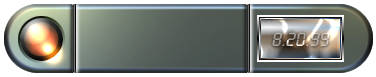
If you want to give the button or button light some colour, just use the Hue & Saturation filter on that layer, with the 'Colorize' box checked ON. Depending on the amount of brightness or darkness you give your colour, you may have to move the Saturation slider down to 75 or 50. I used 50 for the above example, with the Brightness slider left at 0.
If you'll notice here also in the above sample image, i applied a bit of a small light glare, or wash-out effect from the light of my button, shining on to my interface surface just below the button light. Adding that is very simple.
- Just create a New layer above all your button layers.
- Set it's Blend mode to Color Dodge.
- Use the Eye Dropper tool and grab a sample of the colour from your button light that is at the bottom right edge of the lighted area; try to sample a middle tone from the light's colour. Not too dark, not too light.
- Grab a medium to small sized, soft edged Airbrush.
- Use a very small, quick stroke of the brush to apply the colour to the rim of the light button, and onto the area of the interface that is just outside of the button. Don't hold your mouse down too long or the colour will get to thick and ruin the subtleness of the effect. Use the Undo command (Ctrl+Z) if it doesn't turn out right, and keep trying it until you get an effect you like. Since this is a small lighted button, it won't give off much light. So don't add a huge light glare effect onto the interface body. Your brush stroke is easiest to apply if you pull the tool in the same direction you applied your gradients; top left to bottom right.
- Now, to tone down the harshness of the Color Dodge layer, Duplicate that layer and set the duplicate's Blend mode to Hardlight instead. You're done.
GURU TIP: (for those using Javascript)
If you intend on using Javascript to produce an image flip effect for your button(s), then you would want to create two separate versions of your buttons.
The first version (solid button OFF state, top of the page), would be the default button when your interface first loads in. It can have colour those also if you wish. The second version (button light version, above), would be the one you'd have appear when a users mouse moved over the default solid button, or some other area of the interface. The same process would also apply if you just used a simple 'button down' effect instead of the button light effect. You'd still need to create two versions of your button(s).
GURU QUICK IDEA!:
If you're using any Javascripting for a rollOver effect, you could also have the default OFF button turn into a small animation of some kind. That's a great way to add more ACTION to an interface. One idea might be to create a strobing light animation. Just remember to try and keep the file size down to 2 or 3kb maximum; or it won't load fast enough for the user to even see it (unless you deploy an image 'preloading' script as well).
3D Shapes / Inset Lines / View Screens
Buttons / Texture Mapping / Adding Text
> To the Top <
> Back to "2D & 3D" <
- Page 4 - |