 |
|
 |
Before we get under way... I want to let you know that the instructions below will not be explaining how to create the Interface that was seen on the front page. |
Instead, the shape and design of your Interface, should you choose to ceate one, will be left completely up to you. You'll be using your imagination more for this Session than you have for the others, but I don't think that will be much of a problem for you all.
So after you've gone through these steps and feel you understand them well enough, I suggest you try applying them to a more specific image, such as an Interface or perhaps some buttons for a web page, etc.. |
|
Alright then, let's begin... |
|
 To begin with: To begin with:Create a new document - 300x150 will do for our purpose here... Make it RGB / background=white / resolution=72. |
|
 Step 1 Step 1The Brush When your new document is opened, the first thing you need to do is create a New Layer. You can name this layer shadow. Now grab a brush (use the Airbrush tool) - any shape will do for now just to get a basic understanding of how this effect is achieved. If you want to, you can save this picture to the left and make a custom brush out of it. (if you're not sure how to do this, go to the user Beginner section and read the page to learn how to create custom brushes. Then return here when you're done). Or if you like, you can just use text. Just be sure that your foreground color is black. Now apply the brush to the canvas, or type in your text. Try to make sure that your edges are fairly clean. NOTE: Photoshop 5+ users will need to Render their text layer before continuing. Once you've done that, load that layer's transparency. (Press the Ctrl key (Mac:Command) and click on the Layer's name) |
|
 Step 2 Step 2The Channel Mask Once you've loaded the layer transparency of the brush or text you used in the previous step, click on the tab for the Channels palette.
Now create a New Channel by clicking on the bent piece of paper at the bottom middle of the palette. You should see your canvas go black, right? And the marching ants dancing on your canvas, right? The name of this channel should default to #4. Go up to the IMAGE menu and choose ADJUST / AUTO LEVELS. This will balance out the different levels of grey that may be in your mask. If there doesn't appear to be any change in your mask don't worry about it. This is simply a precautionary measure. |
|
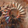 Step 3 Step 3The Texture Ok, now create another New Layer. You can name this layer main image. After applying the Lighting FX Filter, and using the channel mask above as the texture map, the image to the left is what I got. Basically your shape will appear to be raised up, as if it were being pushed through the back of the texture picture.
Start off by opening a texture that you like. Select ALL (ctrl/command + A) / open the EDIT menu / choose DEFINE PATTERN. You can then close the texture picture.Now, with the 'main image' layer activated, do this: Open the EDIT menu / choose FILL / from the pop down list choose PATTERN. You should now have your texture completely filling the main image layer. Right? The Finished Image |
| Step 4 Here is how you will apply the Lighting Filter to the texture on the main image layer:
a) Make sure your main image layer is still picked, and nothing is selected. Now, the last step is to open the Texture Channel menu on the bottom of the filter window, and from the list scroll down until you see the #4 channel. Pick that one. When it loads in look at the preview picture to see the effect it creates on your texture. Unless you wish to make further changes to the settings, you can now hit the OK button to apply, and close the filter. Please note that these settings are simply the ones I used to get the effect you see in the brouche type image near the top of this page. There are literally unlimited amounts of settings that could be used to achieve different looks and effects for your images. I highly recommend that you experiment with this filter to better learn how it works and what you can do with it.Things to try: If you look on the right side of the filter settings you will notice that there are two squares. These squares are the colors of the lights that you are applying to your image. Try experimenting with different colored lights to get special effects on photos or text images. If you try some of the other premade settings in the pop-down menu list, you will see various types of settings that you can try, and use. |
|
|
| |
| Step 5 Now we'll finish up by cutting off the excess from the texture picture...
Now you should see your texture on the main image layer with a sort of buldge in it that has the shape of your brush image or text. Similar to the effect in the picture up beside Step 3.
You should now have a fairly 3D looking image. Right?
One more thing! |
|
Well that's about all there is to it. If any of this seems unclear to you please don't hesitate to let me know ok. But please DO take the time to reread this page first, to see if you've perhaps missed or misinterpreted something while going through the steps. On the last page we will talk a bit about SAVING images and ways that might help you to keep their file sizes down and also how to make them look more like the original, uncompessed version. Please read on... |
| "The Photoshop Guru's Handbook" ™ and all contents of this site are copyright 96/00 Mark Anthony Larmand - (aka theKeeper) all rights reserved. |