 |
|
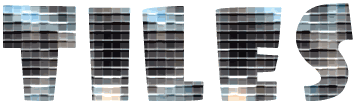
| Xtreme Textures A word to the wise... Please try to remember that what you are learning here, and in all of my Sessions and Examples, is not really what you are seeing. |
| Step 3 The opposite of positive is?... Ok, Duplicate the "Texture 1" layer now, and name it "Texture Negative". Now what we want to do is invert the contents of this layer, so that it resembles a photo negative. To do this, open the Image menu and choose ADJUST / INVERT. Or just hit Ctrl/Command + I on your keyboard.
Now set this layer's Blend Mode to DIFFERENCE. Don't worry, the "negative effect" is supposed to change back to a normal one. That's because we're combining this layer with the texture pattern on the layer below. Think of it this way: We inverted the layer to a negative right? Then, we set the layer's Blend mode to Difference, which is also a form of "negative". So in essence, we canceled out to a positive again. Right? But don't be fooled! It only looks that way. This is one of those "read between the lines" things I was telling you about. If you turn off the "eye" for the Texture Negative layer, you'll see that it is actually having an effect on the way our image looks. Try it and see! Pretty wierd huh? To finish with this layer, let's add a tiny bit of depth to our text. Pick your Move Tool and use your arrow keys to nudge the Texture Negative layer up 4 pixels. |
||
| Step 4 Putting some edge on our graphic Now we're going to create the shiny metal borders for our text by using a simple combination of black and white outlines. These outlines will be set to specific blend modes, that will produce a metallic effect when combined with the texture layers. To start with, hold your Ctrl/Command key down and click on the Name area of the Texture Negative layer. This is a short-cut to loading a layer's transparency (or in other words, selecting the contents of a layer). Remember that, you'll find yourself using it a lot. Now create a New Layer, and check that your Foreground Colour is still black. Open the Edit menu and choose STROKE Set the stroke width to 5 pixels. (try 3 if your text is smaller) Then set the Location to Inside. The Opacity should be at 100%, and the Mode should be on Normal. Then hit OK to apply the stroke. Set this layer's Blend Mode to Overlay, and deselect (select none). Now use the Move tool and arrow keys to nudge this layer down 3 pixels. Name this layer "border shadow". Duplicate the "border shadow" layer and rename it "border highlights". Hit Ctrl/Command + I to invert the contents of the layer. Use the Move tool and arrow keys again to nudge this layer up 3 pixels (to it's original position). The nudge it 1 pixel to the left as well. This will create a thin dark edge around the image, and help define the borders. Now set this layer's Blend Mode to Exclusion. |
||
And there we have it! We're done! What you should now be seeing is a similar effect to the one that you see in the header graphic at the beginning of this Session. If you didn't get an effect at all like that one, please go back and review these steps to see that you haven't missed something. It's really quite a simple effect to achieve. TIP: The secret here lies in the Blend Modes that we used, and in the off-setting of the layers. Don't forget to save your document now if you intend to use it for something, or want to come back to it later. The finishing touch: To finish up our image we'll produce a drop shadow using the "shadow" layer (that was the first layer we created in this document). Activate the "shadow" layer now and make sure that the Preserve Transparency box is unchecked (turned off). Open the Filter menu and choose Blur / Gaussian Blur. Set the Radius to 2 pixels and click OK to apply. Now use the Move tool and arrow keys to nudge the shadow down by 3 to 5 pixels. Or however many you'd like. Set the Blend Mode to Multiply and we're finished. I'm going to leave the background for this image up to you people. Try using some of Photoshop's other native filters to create an interesting background. Don't be afraid to be bold here either. Let your imagination run away and come up with something that is suited to the hard-edged look of this effect. |
Well folks, another Session has been logged. You all get an "A" for effort, and an "A+" just for showing up. :?)
I hope this has been a fun and informative one for you all, and I look forward to seeing you again at the next Session.
For now,
Onward'n'Upward!
theKeeper
| "The Photoshop Guru's Handbook" ™ and all contents of this site are copyright 96/00 Mark Anthony Larmand - (aka theKeeper) all rights reserved. |