First, activate the Background layer by clicking on it.
Now click on the AIRBRUSH tool & grab a Medium size brush. I used the largest hard-edged brush in the palette. Make a wavy or squiggly line from the top left of the canvas down to the bottom right. I found that a #999966 color produced a nice effect, or perhaps a Pastel Blue. It's up to you.
The backdrop effect we're looking for, for this design, is sort of a splashed paint effect on a wall. But you can practise THAT effect later. For now, just fill in some area behind the gradients.
If you don't get the effect you want the first time, just UNDO it and try again. You don't have to draw your wiggly line fast, move the brush as slow as you have to to stay inside of the canvas borders.
SEE?! See how the color shows through, even though this layer is on the bottom & underneath all the other layers? Isn't THAT interesting... hmmm. If you want to see just waht i meant by the 'Shadow' layer blocking out the effect of the 'Negative' layer, simply turn the opacity for the 'Shadow' layer back up to 100%. Don't forget to turn it back down to 40% when you're done checking the effect.
Things aren't always as they appear to be in Guru-Land are they? ;?)
Now, just to add a bit of character to the backdrop I applied the Ripple Filter to it. You can find it under the Filter menu and in the Distort submenu. I used large ripples set to about 300 or so. The main reason I used this Filter was because the effect it produced ran diagonally along the lines of my design; to left to bottom right.
Ok, our design is now almost complete. There's just a few minor adjustments that need to be made to finish off the look and tidy up the effect we're going for here.
Let's start by giving our spheres more pronounced features.
To get this all we have to do is set the shape 3 & shape 4 layers to 'Hard Light' mode, instead of Difference mode. This will accentuate the light and shadow properties of the gradient.
Feel free later to experiment with other Blend Mode settings for any of the layers. It can really change the overall look of the design.
Now Activate the 'negative' layer and use the Move tool & the arrow keys to nudge this layer DOWN 4 pixels & RIGHT 3 pixels. This will produce a slight etched glass effect, as well as giving our shapes a little depth.
Now Activate the 'shadow' layer and use the Move tool & the arrow keys to nudge this layer DOWN 6 pixels & RIGHT 4 pixels.
(Do not hold the shift key while moving this layer. That would move it by increments of 10 pixels. We only want to move this layer 1 pixel at a time.)
TIP: In case you hadn't noticed yet, Difference Mode has a sister mode. That would be EXCLUSION. Both of these modes produce a similar effect, with just a few very obvious exceptions.
Exclusion mode produces a slightly different, and more subtle effect than does Difference mode. Sometimes it can have a tendency to wash out the colours of your objects. But because it is more subtle, it does not produce the jagged lines around the edges of objects like Difference mode does.
You might also be interested to know that there are other Blend Modes that are related in this way also. Each producing a slightly different but similar effect.
A couple of them are: Overlay & Hard Light / Screen & Lighten.
I'll let you find the others by experimenting. Have fun!
Ok one more thing to finish up the look.
There's something missing in our design that would help to define the shape of our objects. Can you think of what it might be?
It's highlights. Yes, we need some extra highlights on our edges to help give the impression of shape and depth. Nothing too strong, we'll keep it subtle here.
Here's how we'll do it:
First activate the 'negative' layer and load it's layer transparency by holding the CTRL/COMMAND key and clicking on the layer name.
Then create a New Layer and drag it right above the 'shape 0' layer, to the top of the palette. Now make sure your Foreground color is White and STROKE the selection by 3 pixels on the Inside. (Edit/Stroke)
Don't deselect yet though. First you must apply a 1.5 pixel Gaussian Blur. Then Deselect. (Select None)
Now pick the Move tool and use the arrow keys to nudge this layer 3 pixels to the left & 4 pixels up, set this layer's Blend Mode to DIFFERENCE.
And to finish it off, Duplicate this layer and set it's Blend mode to Overlay.
There, add some text if you like, and we're done!
Here's how my finished design looked:
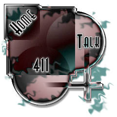
It's pretty interesting what you can create using just one Blend mode isn't it? That's the power and beauty of the Difference mode that i like. :?)
Now there are a LOT of modifications that could be made to this design to really change it's look, but i'll let you play around a bit with all the layer's Blend Mode settings to see what you can come up with for variations on this theme.
One thing you should take note of though is that if your gradients have too much black in them, then they will be less 'transparent' and objects on the lower layers will not be as visible through the top layer objects. To make your objects more 'see-through', try using more white in your gradients for the top level objects. The main reason for this is because the Difference mode shows no effect on black and maximum effect on white. It's the nature of the beast, so-to-speak.
In the next Session we'll explore the Difference & Exclusion blend modes further.