 |
|
Session 3 |
Drop Shadows |
|
Supplies
for this Session: And: |
|
|
Shadow Example #1
||
Shadow Example #2 Things to think about || End Quote || The Edge |
|
Preface Now I know that this
may not be the ground breaking, jam-packed, smoke & fireworks kind of
Session you may have been hoping for, but I've been getting more and more
letters sent to me concerning this subject, and I think it's just about
time we all got a handle on it. |
| 1) |
And
Guru said "Let's have some light!... please?" First of all, you
will see that the shadow is very dark. This means that the light source
that is shining down on the text is very bright. Second of all,
you will see that the shadow that this text is throwing is very close
to the object that is throwing it; i.e the text. If an object is elevated
off a surface the light source shining on the object will then be able
to get underneath the object. This will in turn saturate the shadow with
light and cause it to become lighter in tone, as seen here: |
| 3) | Things to think about... Oh yeah... one more thing to take note of: (and this is very often overlooked) You will notice that if you look back at Example #1 again, at the part of the shadow that is just off the edge of the letters, you will see that there are gaps in between the text and it's shadow. Small bits of white area. This means that the text itself is paper thin. It has no apparent thickness to it at all. If it did, given the height that it is floating above the page, you would not see any white spaces between the text and it's shadow. Take a look at this example: 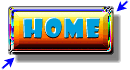 We have here a very familiar object, a Web page button. Look at the shadow on this button. This shadow would suggest that this button is 'floating" above the page. Why? Because one characteristic of the objects shadow tells us so. The blue arrows are pointing to the spots that gives this fact away. The gaps that the blue arrows are pointing to tell us that the object is either 'floating' above the surface, or has a base beneath it that we can't see that is smaller than the outer circumference of the button. I want you to do a test yourself right now: Grab a business card or a floppy disk or something similar that you might have handy. Now hold that card just above a surface that's handy, say a table or desk if you're at one. Stand up and look down at the card, so you're on the same perspective to it that you are when you're looking at pictures on someone's Web page. Make sure that the light source in your room is not coming from directly above you though. It must come from either side of you. Does the shadow of your card have a similar appearance to this button's shadow? Can you see the same spaces that the blue arrows are pointing to? Then you should understand what I mean by "floating" above the surface or page, right? Now just imagine if that card you're holding was a lot thicker and it was just sitting on the surface of your desk or table. What do you think the shadow would look like? Those of you who said to yourself "it would probably look the same as the Web page button's shadow"... BEEP! Ooooh, I'm sorry, no toaster oven for you. Go ahead and get a big thick book and lay it on your surface. A telephone book would be good. Now angle yourself so you can see the front edges of the book. Can you see how the shadow is still attached to the book? There are no gaps at the corners of the book. This kind of shadow effect will make objects look like they have depth. If you do this with a Web page button you get this effect:  Now the button no longer looks like it is floating, but instead looks "anchored" to the surface or page. Your eye tells you that the button must have a thickness to it, because of the characteristics of it's shadow. I have very (and I mean VERY) rarely seen this effect used on any sites I have ever been to. I'm not sure why. I use it, and like to use it, because it gives a different sense of depth to a page when your buttons and pictures and image maps are firmly fixed to the surface of your page instead of everything floating around in space. Even more depth could be achieved on a Web page by combining anchored objects and floating ones. But when all is said & done... It's just another trick to put in your bag of Web page design techniques, that's all. |
| 4) |
End
Quote: NEWS FLASH! Just in case you
hadn't noticed... |
|
Step
over The Edge!
|
| "The Photoshop Guru's Handbook" ™ and all contents of this site are copyright 96/00 Mark Anthony Larmand - (aka theKeeper) all rights reserved. |